Data Visualization Best Practices: Tell Stories with Data
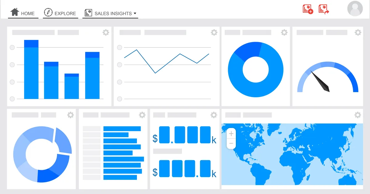
A great visualization turns a confusing spreadsheet into an instant insight, while a poor one misleads or bores its audience. Data visualization is as much about communication and honesty as it is about charts.
This guide covers the principles and best practices that help you tell clear, accurate stories with data.
1. Start With the Message
Before choosing a chart, decide what single point you want the viewer to take away. A visualization should make that message obvious at a glance. When you lead with the message rather than the data, every design choice becomes easier and more purposeful.
2. Choosing the Right Chart
- Use bar charts to compare quantities across categories.
- Use line charts to show trends over time.
- Use scatter plots to reveal relationships between two variables.
- Avoid pie charts for anything beyond a couple of slices.
Match the chart to the question
The right chart is the one that answers the viewer's question with the least effort. When in doubt, a simple bar or line chart usually communicates more clearly than a fancy alternative.
3. Designing for Clarity
Remove clutter, label directly, use color with intent rather than decoration, and ensure adequate contrast for accessibility. Every element that does not serve the message is noise that weakens it.
4. Visualizing Honestly
Start bar chart axes at zero, avoid distorting scales, and never cherry-pick ranges that mislead. A visualization carries authority, and with that comes a responsibility to represent the data truthfully.
5. Key Takeaways
- Decide your core message before designing anything.
- Match the chart type to the question being asked.
- Simple bar and line charts communicate most clearly.
- Remove clutter and use color with intent.
- Represent data honestly with truthful scales and ranges.