Color Theory in UI Design: Choose Colors That Convert
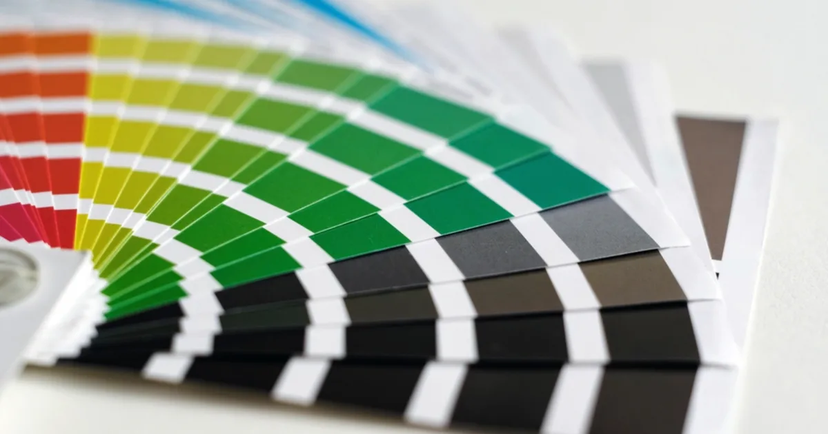
Color is one of the most powerful tools in a designer's kit, shaping emotion, guiding attention, and communicating brand. Used well it elevates an interface; used carelessly it confuses and alienates users.
This guide explains how to choose colors that look great, work for everyone, and help your product convert.
1. The Psychology of Color
Colors carry associations that influence how users feel. Blue suggests trust and calm, green signals growth and success, red conveys urgency or warning. Choosing a palette aligned with your message reinforces it before a single word is read, though context and culture always matter.
2. Building a Palette
- Pick one primary color that represents your brand.
- Add a secondary or accent color for calls to action.
- Include neutral grays for text and backgrounds.
- Define clear states for success, warning, and error.
Use accents sparingly
Reserve your boldest accent color for the actions you most want users to take. If everything is highlighted, nothing stands out.
3. Color and Accessibility
Sufficient contrast between text and background is essential for readability and for users with low vision. Never rely on color alone to convey meaning, since many people cannot distinguish certain hues. Accessible color choices serve everyone and are often legally required.
4. Color That Converts
A high-contrast call-to-action button draws the eye and increases clicks, while a cohesive palette builds trust and a sense of quality. Test your color decisions with real users, because what looks good is not always what performs best.
5. Key Takeaways
- Colors evoke emotions that reinforce your message.
- Build a palette of primary, accent, neutral, and state colors.
- Reserve bold accents for the most important actions.
- Ensure strong contrast and never rely on color alone.
- Test color choices, since pretty is not always effective.