Responsive Design Best Practices for 2026
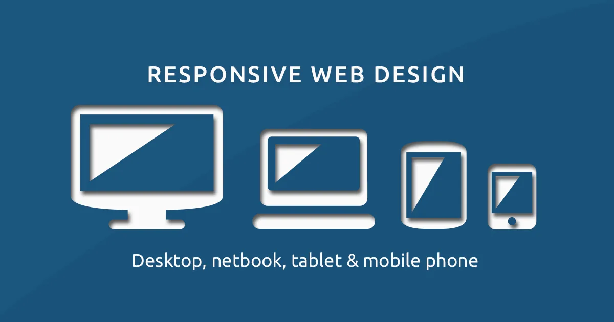
People browse on phones, tablets, laptops, and screens of every size, so a website must adapt gracefully to all of them. Responsive design ensures a single site looks and works beautifully everywhere, and in 2026 it is simply non-negotiable.
This guide covers the best practices for building responsive, future-proof interfaces.
1. Start Mobile First
Designing for the smallest screen first forces you to prioritize the most essential content and then progressively enhance for larger screens. This approach yields cleaner, faster experiences than cramming a desktop design onto a phone as an afterthought.
2. Flexible Layouts
Modern CSS does the heavy lifting
CSS Grid and Flexbox make it straightforward to build layouts that flow and rearrange across screen sizes. Combined with relative units, they let designs adapt without dozens of fixed breakpoints.
- Use flexible grids and percentages rather than fixed pixels.
- Set breakpoints based on content, not specific devices.
- Make images and media scale within their containers.
- Ensure touch targets stay large enough on small screens.
3. Performance Matters
Responsive design is not only about layout but also speed. Serve appropriately sized images, avoid loading desktop-weight assets on phones, and remember that many users are on slower connections. A fast site is a core part of a good responsive experience.
4. Test on Real Devices
Browser tools help, but nothing replaces testing on actual phones and tablets. Real devices reveal touch issues, performance problems, and quirks that emulators miss, ensuring your design truly works for the people using it.
5. Key Takeaways
- Design mobile first, then enhance for larger screens.
- Use CSS Grid, Flexbox, and relative units for flexibility.
- Set breakpoints based on content, not devices.
- Optimize images and speed, not just layout.
- Test on real devices to catch what emulators miss.